
There are plenty of tools in react ecosystem which makes the development faster and easier one such tool is the storybook. Let us see how a storybook is used to accelerate the react application development
What is a storybook ?
Storybook is basically a development environment and playground for UI components that create the components independently and showcase the component interactively in an isolated environment.
Storybook runs outside of the main react app so you can develop UI components without worrying about the business logic.
Why a storybook ?
- While using storybook we have the ability to view the component that already have been developed
- View what are the different props those developed component accept
- Ability to visually showcase those component to the stakeholders for feedback
- Apart from these, if we change the props in the component and we can immediately see the changes in the ui without having to move back and forth to the browser and IDE
- Awesome for playing around the components.there are plugins like “actions” and “knobs” which let you play around the component and see how they render with different props
- Makes it easy to visually test edge cases.
Get Storybook installed and running in your project
- In this blog, we’ll use React to build out a mini-component library that has a few different types of buttons to see how Storybook works
- Particularly with Create React App, Storybook automatically detects that we’re using an app created using Create-React-App and installs the dependencies and scaffolds everything for you
To start with let’s create a react app using the command
npx create-react-app storybook-project
After the app is created enter
cd storybook-project
After that to install the storybook in the app use the command
npx sb init
This command will install all the core dependencies, add scripts, set up some configuration files, and create example stories for you to get you up and running with the storybook.
npm run storybook
and that should boot up the Storybook for you with the examples they created for you.
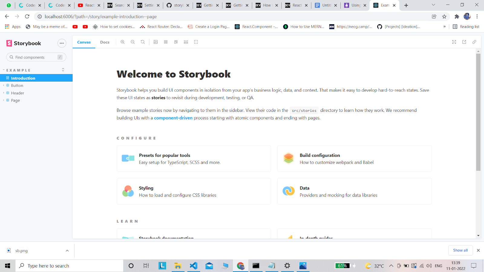
Storybook has pre-written stories in it
We will be creating our own story in the next step.
What is story ?
From the official docs of storybook
“A story captures the rendered state of a UI component. Developers write multiple stories per component that describe all the “interesting” states a component can support.”
Let’s create a demo component to check out how stories work.
Creating our own component
- Before creating our own component storybook is a collection of stories
- And each story represents a single visual state of a component and it is our job as a developer to write stories of an ui component.
- we create in our react application in this blog we will learn how to write a story for a button component
- In this blog, we’ll be creating a component and for this component, we will document stories for them within the components folder. Go ahead and create a button component within the component directory
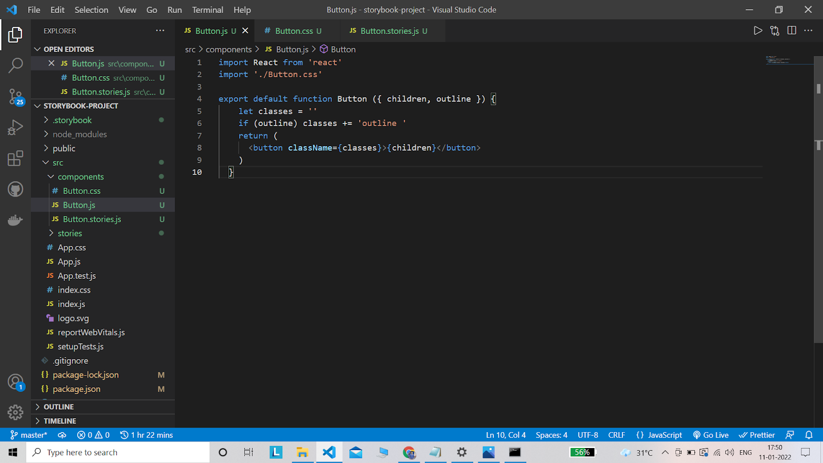
First, create a folder component and we can three files namely
- Button.js – the component itself
- Button.css – styles for the component
- Button.stories.js – stories corresponding to the component
- Now, we’ll make a React component in the Button.js file — it will just render a button and use the children prop for text.
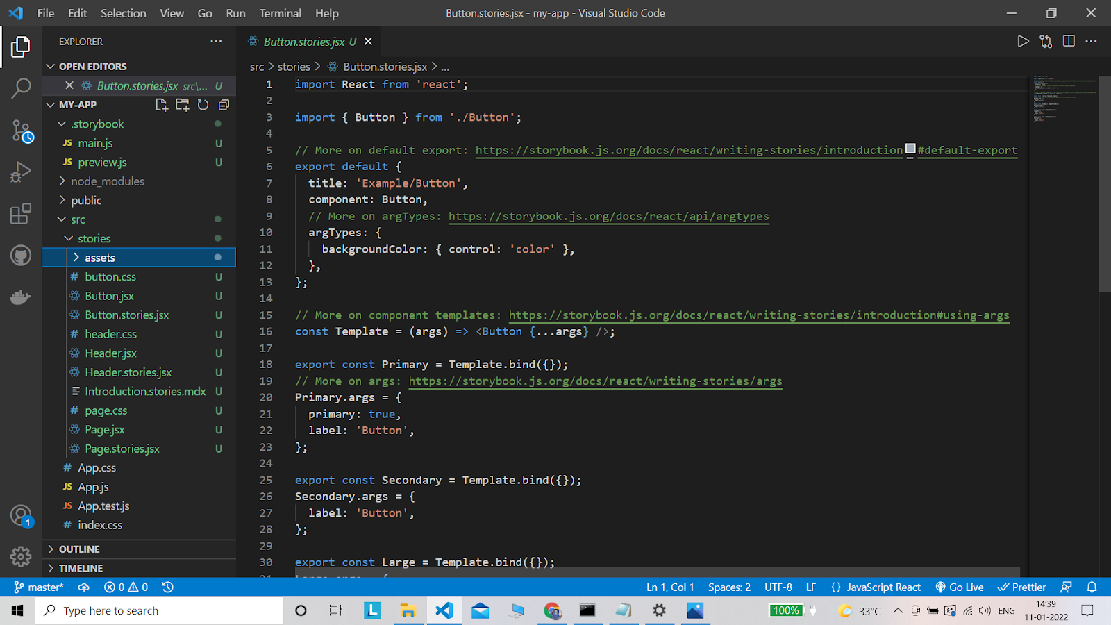
- Next we will add our Button stories to Button.stories.js. First by importing the react component. Then we’ll import our Button component.
Styling our Button component
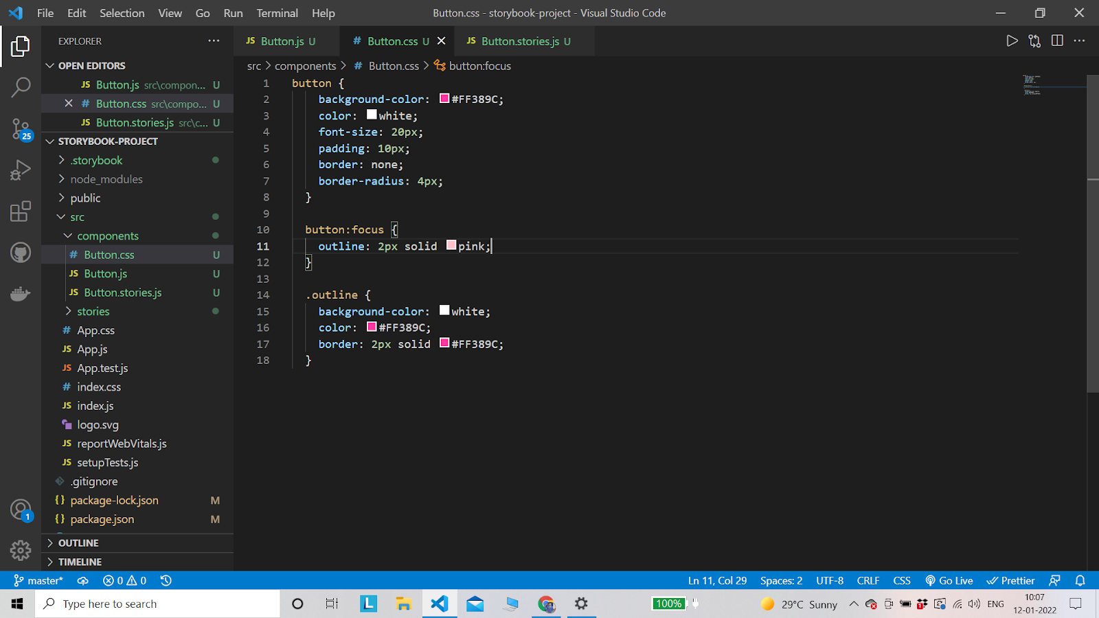
- This applies a few styles to our .button class like adding a background color and changing the font color to white.
- But if you open Storybook, you’ll notice it didn’t do anything. To use it, we need to import it into our component.
- Then we are adding a default export file and we are naming the title ‘Button’. This will render on our Storybook UI as almost a directory name.
- Then we are exporting two buttons, thus the final code in the stories component will look like this
- To define a Story you need to create a named export in the file, so for example we can create a story for the primary button type like this.
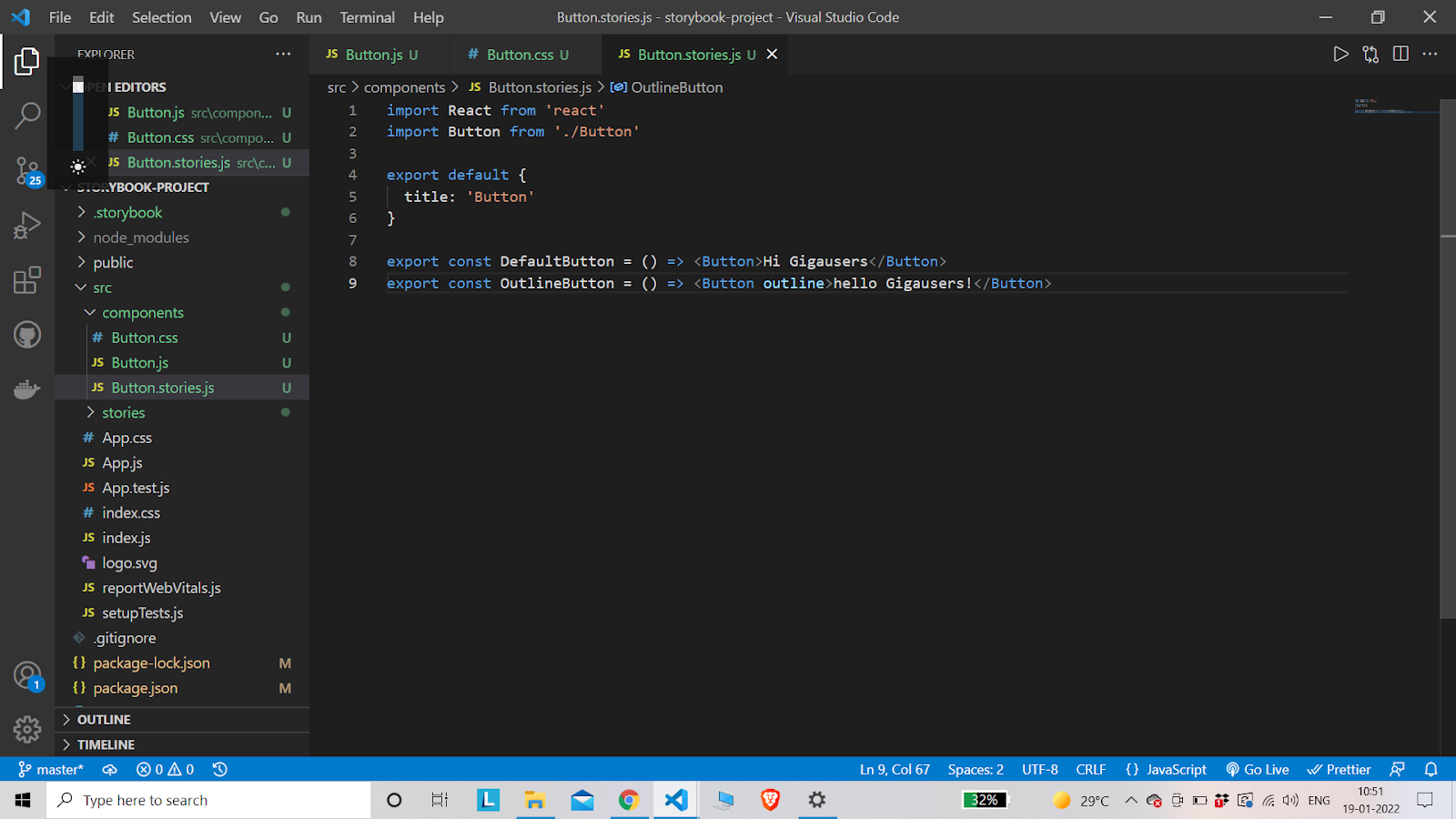
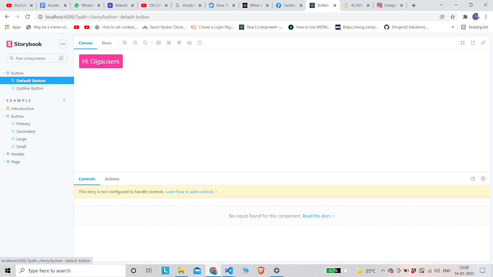
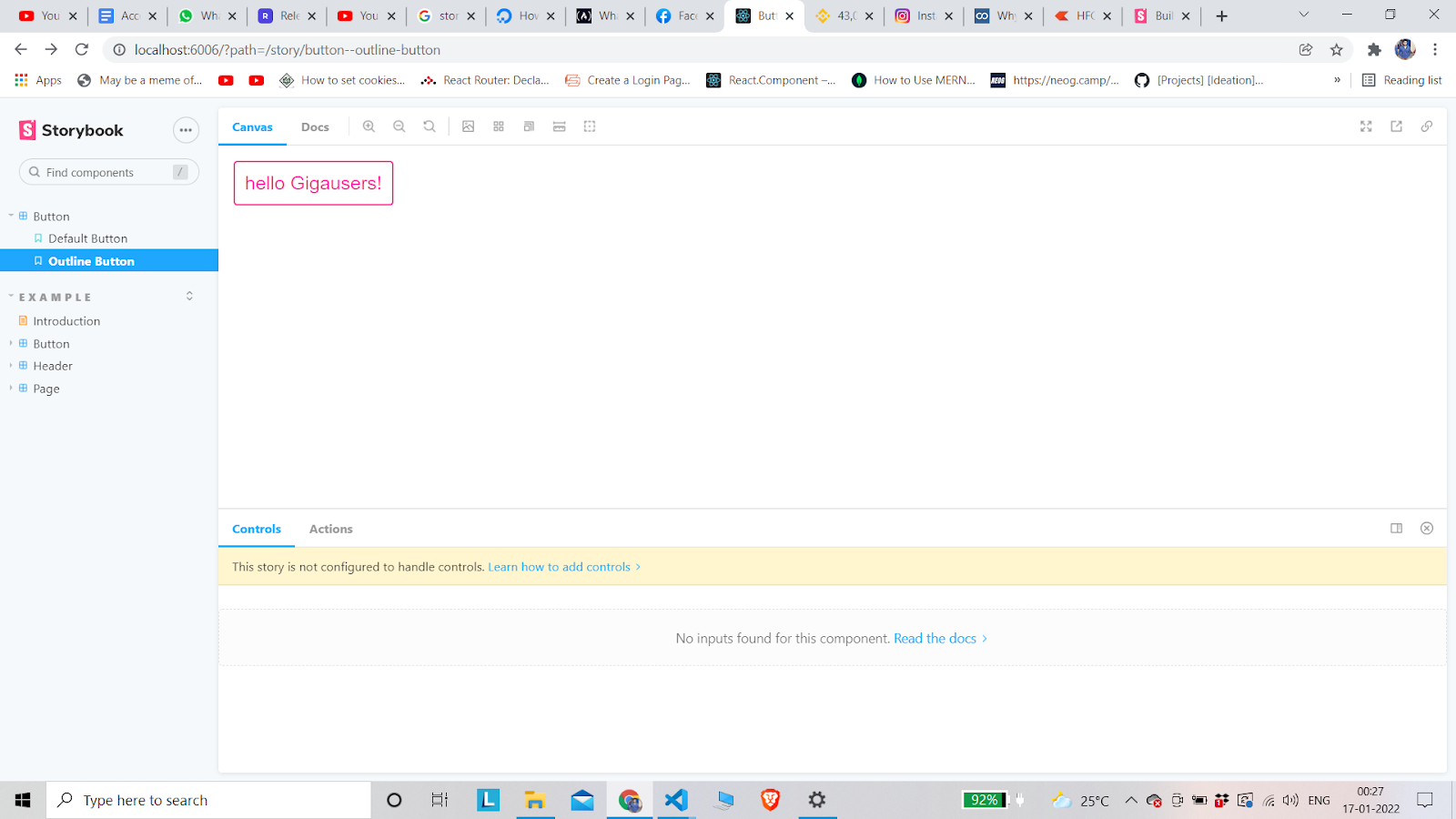
- After the code if we check the storybook window, it will have the topic button and will have default button and outline button in the collection label
Adding more components
As you’ve noticed with our second Repeat step – adding a new component is pretty much the same process for any type of component we want to add. Once we have it in our library, we can develop it in a focused environment and then import it to our app to use.
StoryBook Features
Storybook doesn’t stop with just adding components, it provides the ability to configure Addons that enhance the core capabilities opening up a lot of possibilities.
The addons have two types, the first one changes the behavior of stories, while the second one adds custom panes resulting in changing the storybook environment itself.
Conclusion
Storybook is a new way to create components and share them across the team, you can see how your component looks and what improvements you need to add. making the reusable component easy and maintainable. Storybooks become an important part of front-end development.
You can find the source code here.
Happy Coding 🙂
MOST COMMENTED
Flutter
Flutter Setup
React Native
Learn React Native with a Board Game (Part 1 of 4)
jQuery / Web Development
jQuery DataTable: Sorting dynamic data
Uncategorized
Hibernate – Associations are not loaded
Database / Java / MySQL / Spring Boot
Hibernate Error – Encountered problem trying to hydrate identifier for entity
Spring Boot / Uncategorized
Working with Hibernate in a multi-threaded application
Web Development
Designing REST APIs